
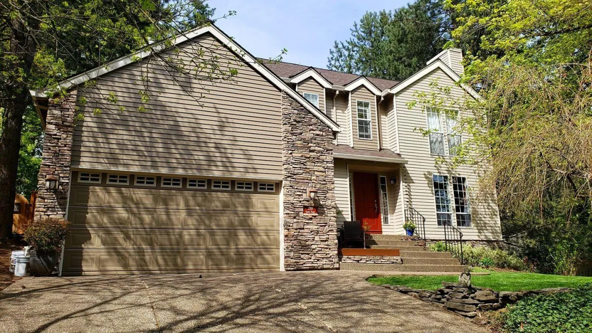
Trusted Residential House Painter in Oregon
Transform your home with the expertise of a trusted residential house painter in Oregon. As a premier painting provider, we focus on quality, precision, and customer satisfaction. Let us bring your vision to life with stunning results.
Why Premier Painting & Contracting LLC?
✓ We provide free estimates and one-year labor warranties
✓ We won't make you wait months to get a new paint job
✓ We offer discounts to returning customers
Your search for a trustworthy painting company ends here. Premier Painting & Contracting tackles interior and exterior painting projects of all sizes. Contact us today to get started on your fence staining or porch painting project. Our crew can paint any interior or exterior surface.

Fast
We pride ourselves on completing every job on time and on budget

Clean
We'll leave your home or office clean and tidy, from top to bottom

Quality
Your satisfaction is guaranteed for every project

Insurance
Our painters are fully bonded, for service you can trust
RESTORE LIFE TO YOUR HOME OR BUSINESS
Get Started on Your Interior or Exterior Painting Project
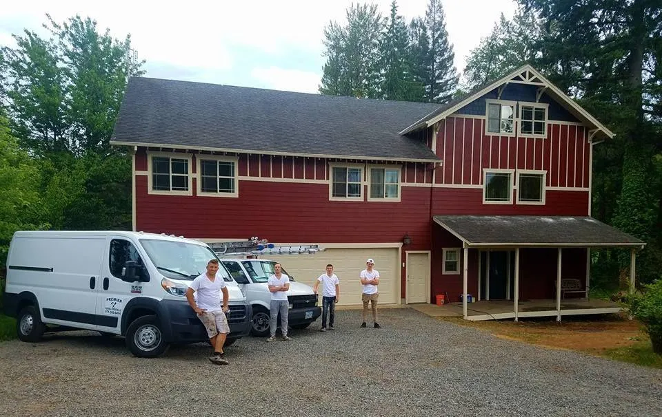
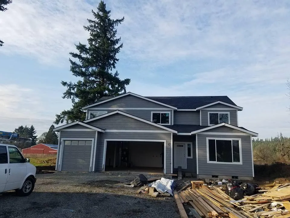
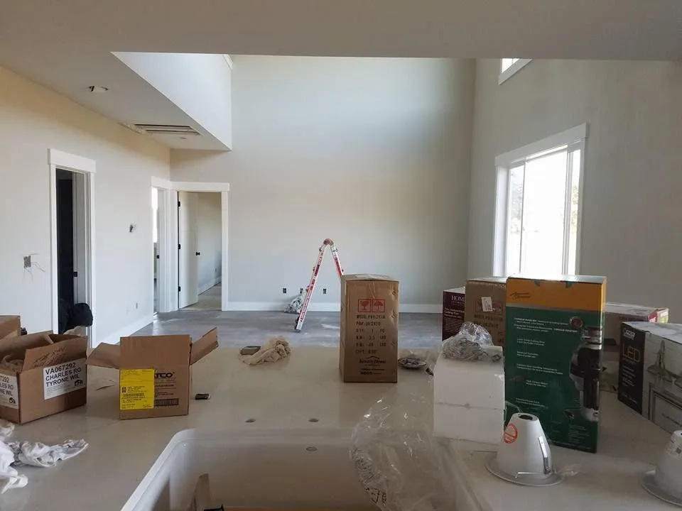
Premier Painting & Contracting paints homes and commercial buildings. We have experience painting homes, apartments, office buildings and retail stores.
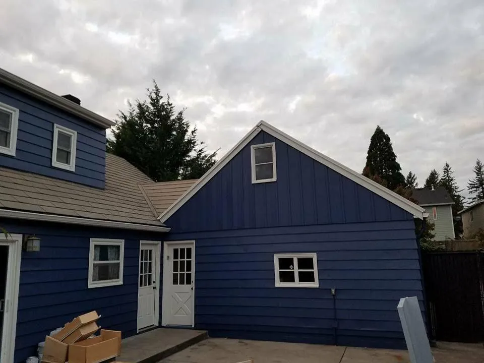
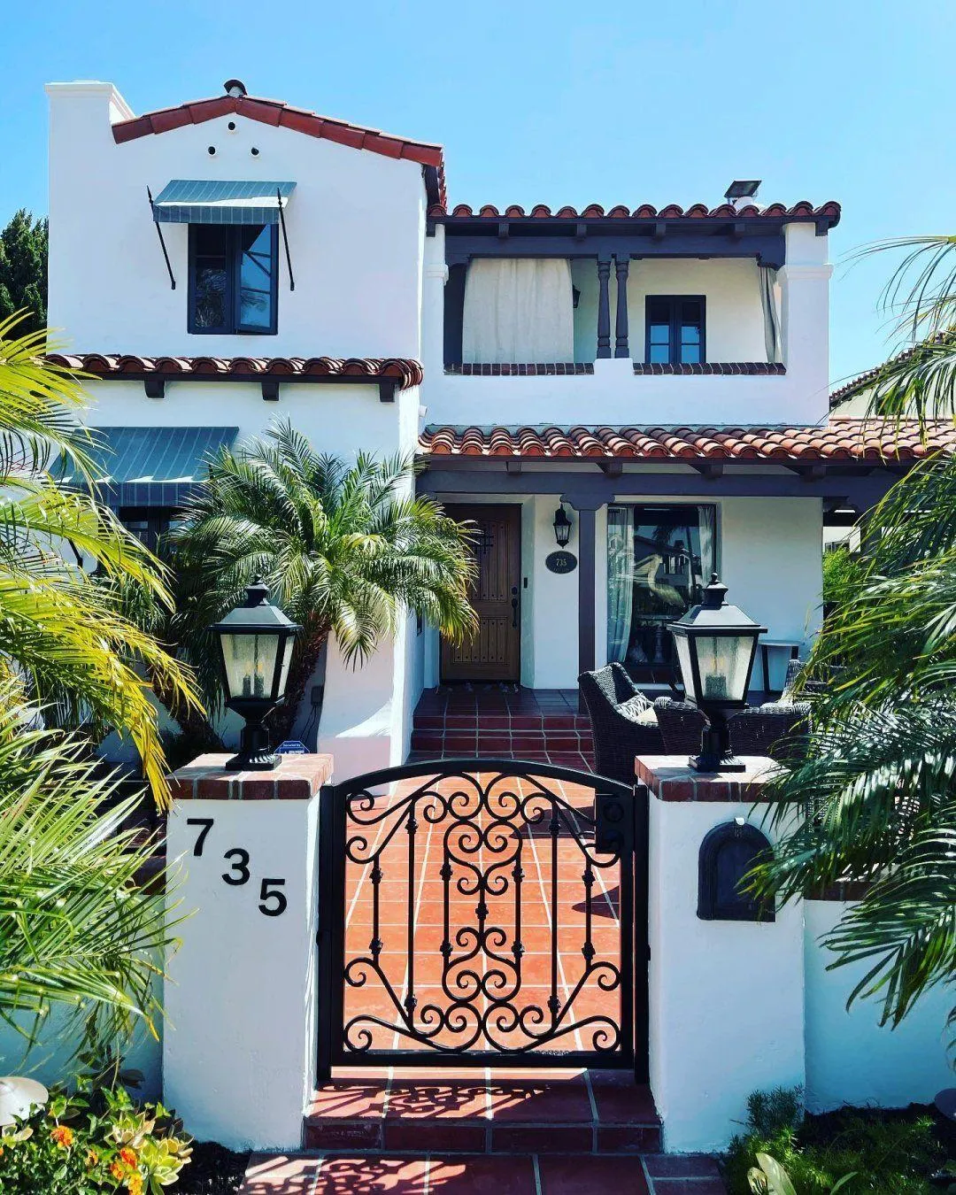
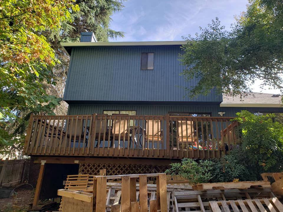
Premier Painting & Contracting, LLC specializes in interior and exterior residential house painting services in the Gresham, OR, area. You can count on us to help you pick out the right colors for your painting project and add several smooth layers of paint to your home or building. By the time we're painting and staining your property, it will look like new.
Call 971-300-8494 today to get your free exterior painting or deck staining estimate. We can answer all your interior and exterior painting questions.
About Premier Painting & Contracting LLC
Give your home the polished look it deserves with Premier Painting & Contracting LLC. Serving homeowners across Oregon, we combine reliability, skill, and attention to detail for results that last. When you search for residential painting services near me in the area, our team is ready to deliver superior service that transforms your property.

Experienced Residential Painting Contractor
As a professional residential painting contractor, we pride ourselves on precision, craftsmanship, and results that elevate the look and feel of your home.
House Painter in Gresham, Oregon
Whether you need a house painter in Gresham, Oregon, or across the region, our expertise guarantees quality results for every job.
Premier Painting Company
As a premier painting company, we handle both interior and exterior residential painting services, giving your home a professional, refreshed look.
About Premier Painting & Contracting LLC
Give your home the polished look it deserves with Premier Painting & Contracting LLC. Serving homeowners across Oregon, we combine reliability, skill, and attention to detail for results that last. When you search for residential painting services near me in the area, our team is ready to deliver superior service that transforms your property.
Experienced Residential Painting Contractor
As a professional residential painting contractor, we pride ourselves on precision, craftsmanship, and results that elevate the look and feel of your home.
House Painter in Gresham, Oregon
Whether you need a house painter in Gresham, Oregon, or across the region, our expertise guarantees quality results for every job.
Premier Painting Company
As a premier painting company, we handle both interior and exterior residential painting services, giving your home a professional, refreshed look.
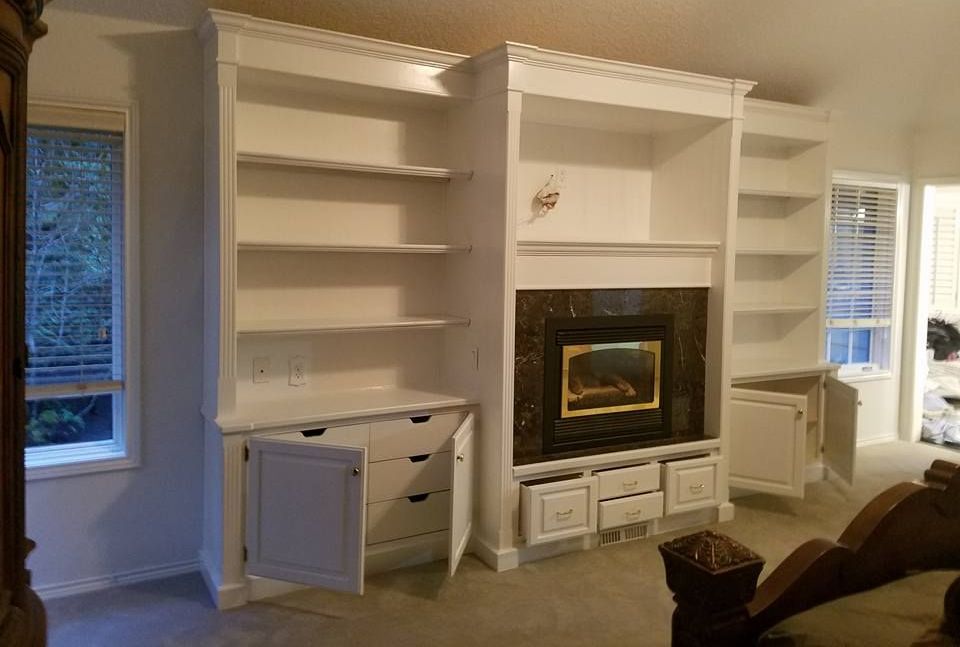
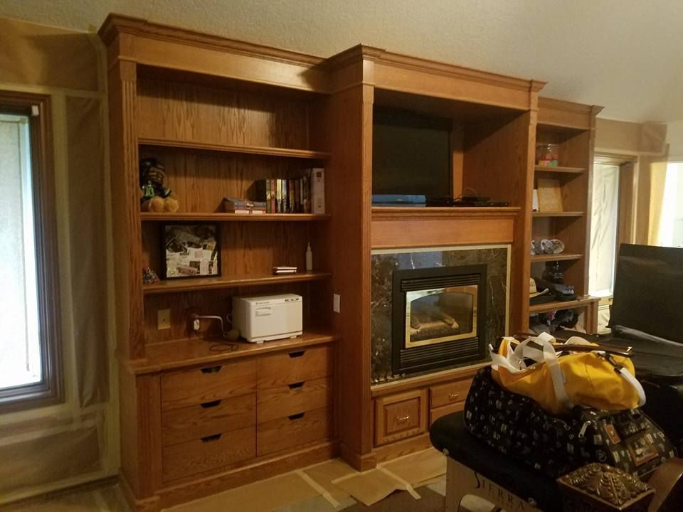
Our Painting Services
WHAT CAN PREMIER PAINTING & CONTRACTING DO FOR YOU?
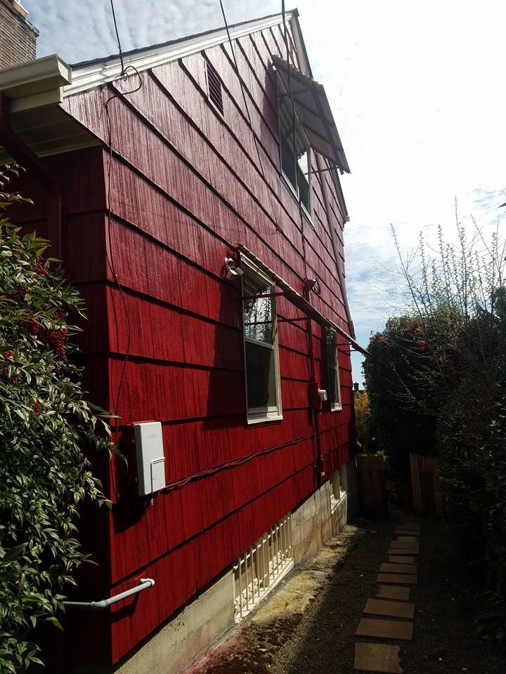
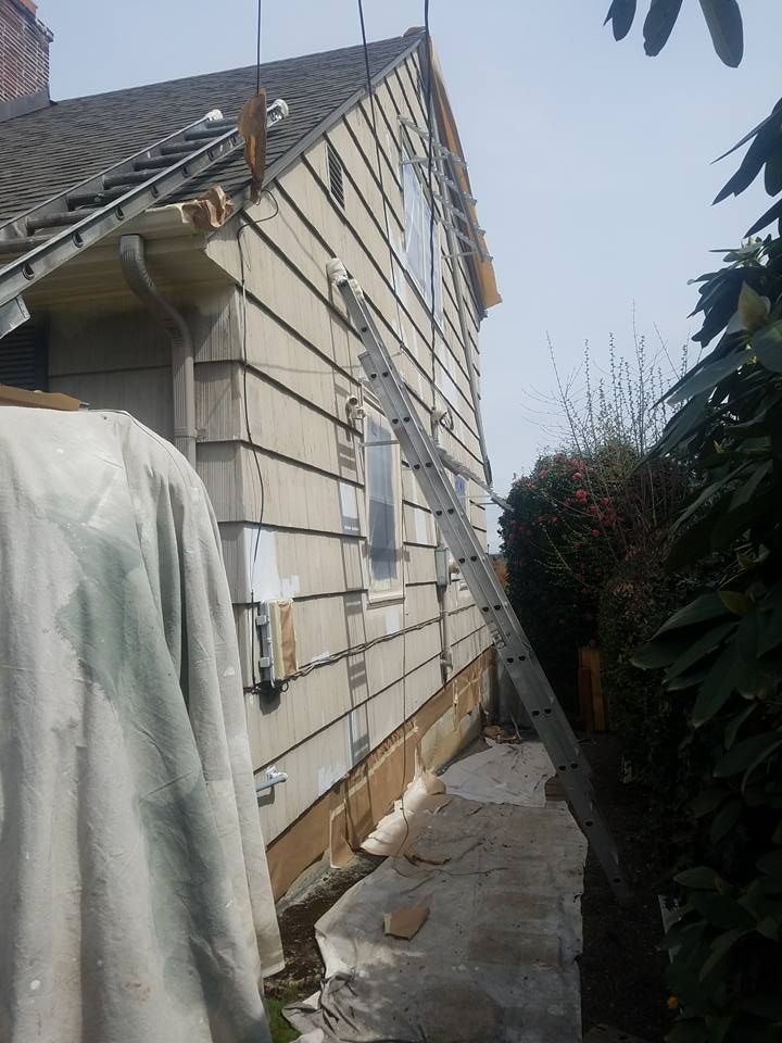
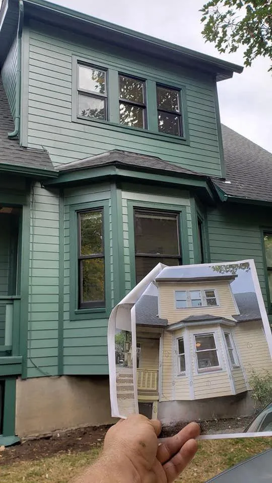
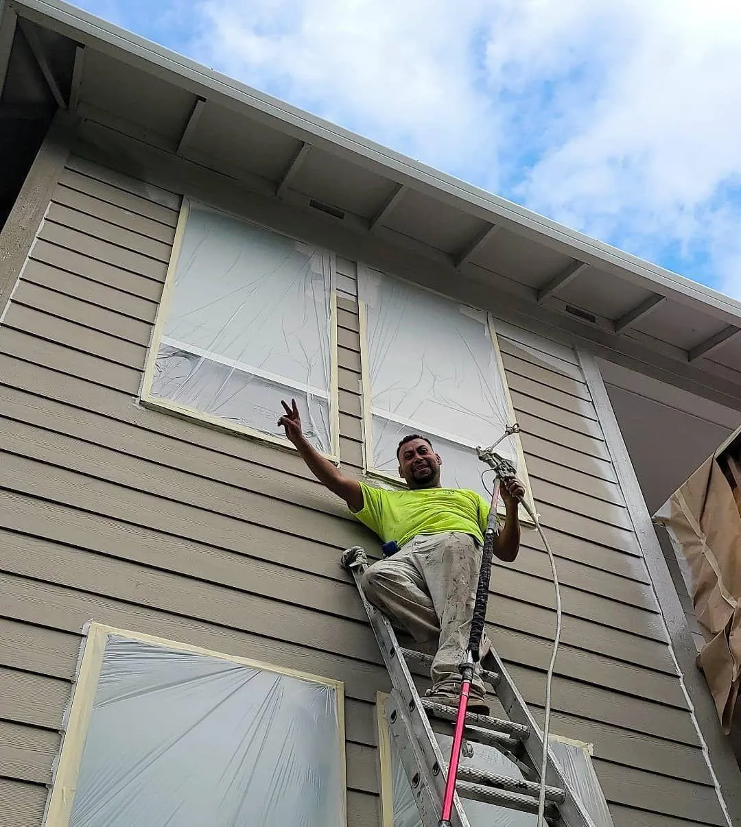
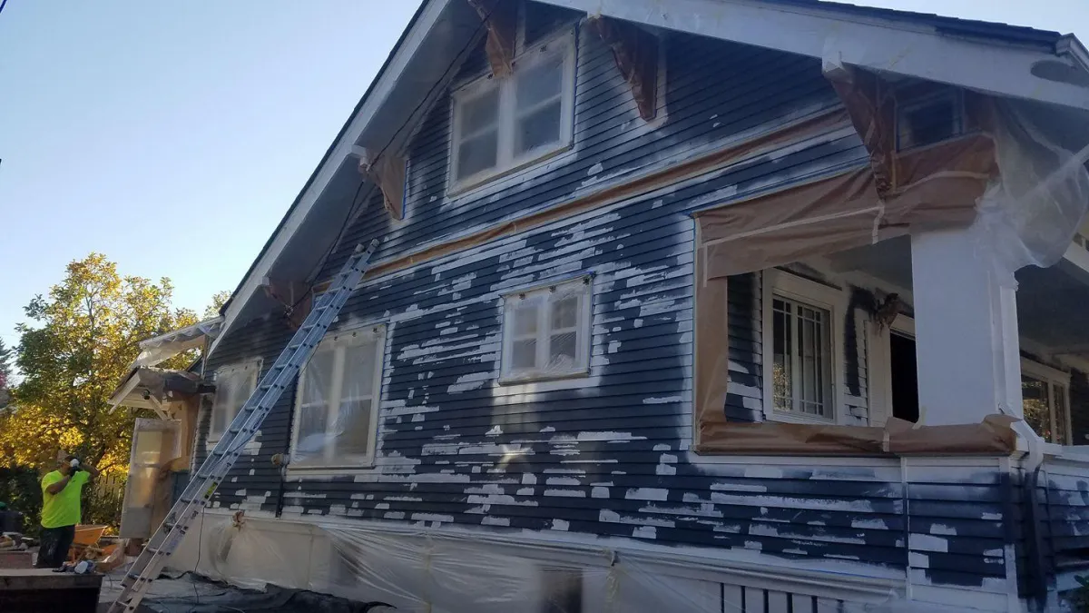
Exterior Painting
Boost your home's curb appeal and safeguard its exterior with:
➡ Full exterior repainting
➡ Thorough preparation, cleaning, and repairs
➡ Painting of trim, soffits, and fascia
➡ Window and door exterior painting services
➡ Surface sealing and protection
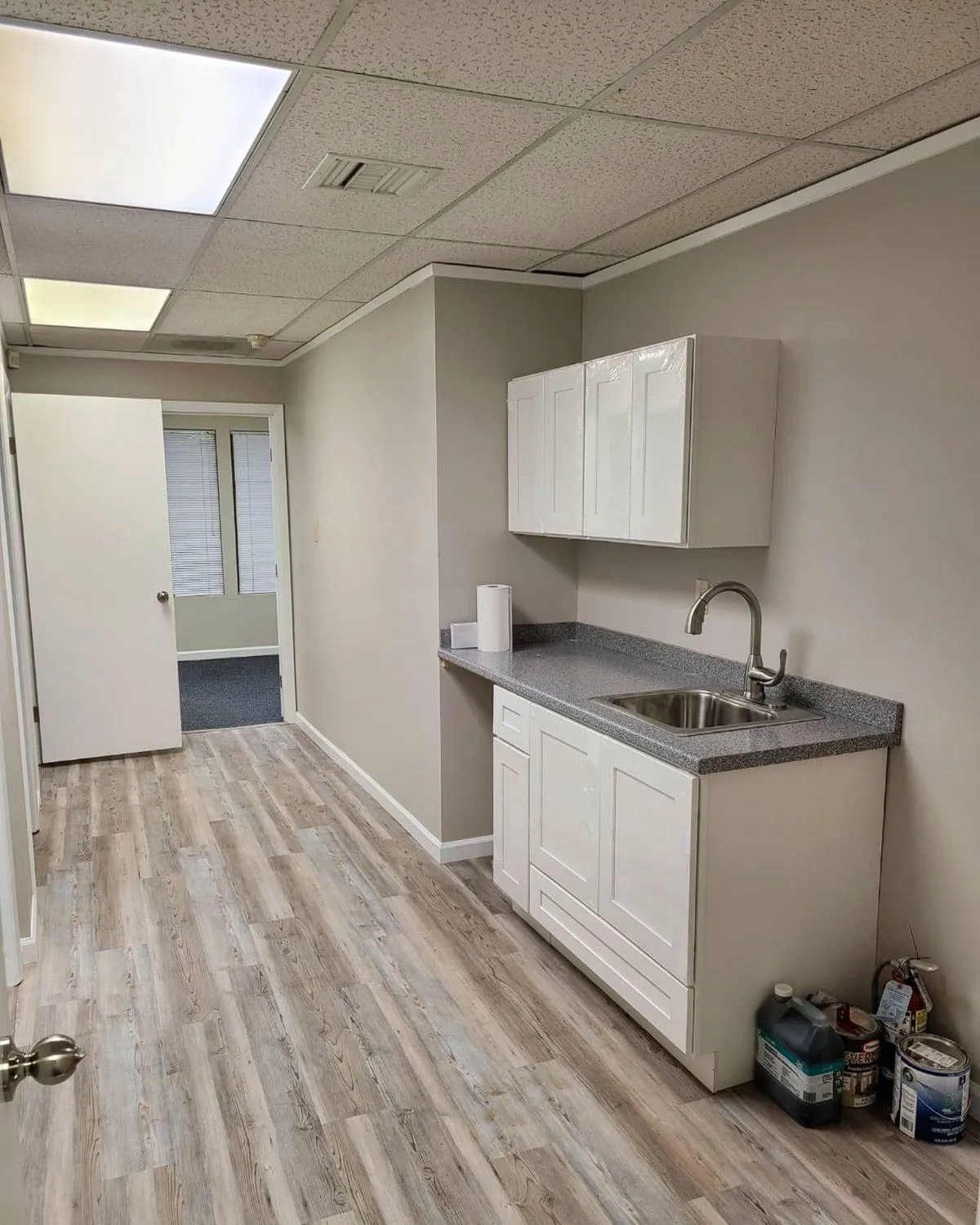
Interior Painting
Transform your home’s interior painting with:
➡ High-quality, fresh paint applications
➡ Wall and ceiling repairs
➡ Painting for trim, baseboards, and doors
➡ Custom accent wall designs
➡ Cabinet painting and refinishing services
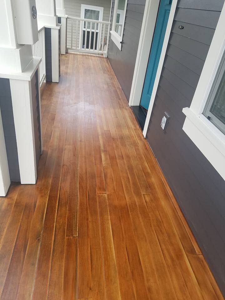
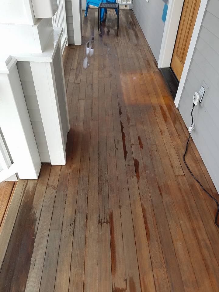
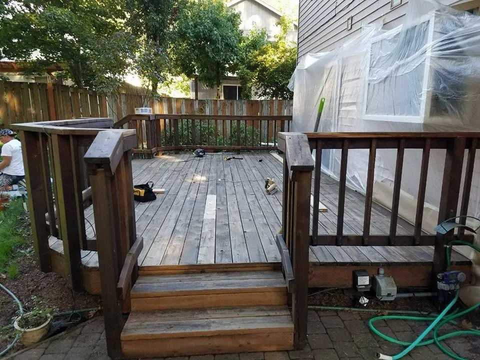
Deck and Fence Staining
Protect and enhance the look of your outdoor spaces with:
➡ Professional deck and fence staining services
➡ Thorough surface cleaning and preparation
➡ Premium stains for durability and weather resistance
➡ Restoration of faded or worn wood surface
REVIVE YOUR FADED DECK OR FENCE
ARRANGE FOR DECK OR FENCE STAINING SERVICES RIGHT AWAY

Hear It Straight from Our Clients

★★★★★ a month ago
Premier Painting & Contracting LLC did a great job on my flooring. The team was professional, on time, and the quality of the work was excellent. The floors came out looking amazing and everything was done clean and efficiently. I would definitely recommend them.

★★★★★ 4 months ago
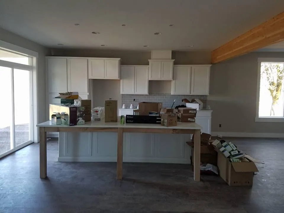
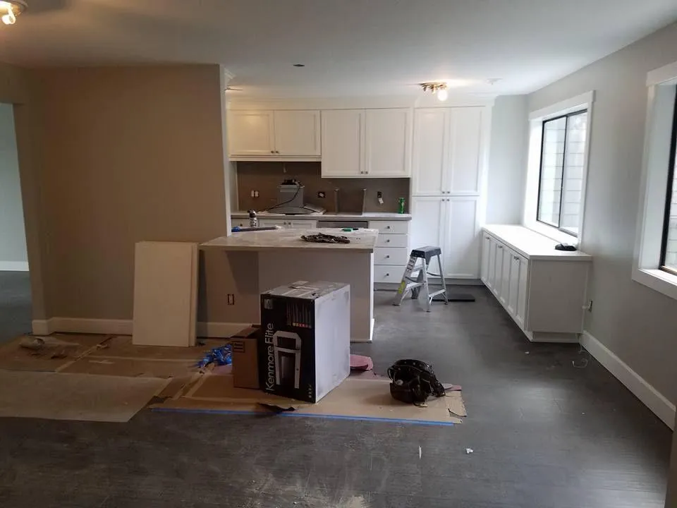
We had a dishwasher failure and our insurance company recommended Premier Painting & Contracting LLC for the kitchen floor/cabinets replacement. I'm so glad that David and his team worked on our kitchen, since it was a very smooth process. They were very understanding of our schedule and worked so hard to get it done quickly. We are very happy with our kitchen, looking better than ever! We'd love to get their help on our future home projects. Thank you so much you all! :)

★★★★★ a year ago
Very happy with the work that Dave and his crew did on my house. Dave is very attentive, and he described to me every step of the way at work. I was very surprised looking at the preparation in the painting, his crew, they are very respectful and very hardworking. At the end of the day, everything was beautiful and very clean, Totally recommended!!!

★★★★★ 2 Years ago
Premier was very quick to come out and give us a bid. Their pricing was substantially lower than the two other bids we received. David was incredibly flexible in providing multiple quotes for us as we also needed a good bit of siding replaced and wanted to price out a few different options. The bid was itemized and clearly listed out what we were paying for.

★★★★★ 10 month ago
David and his team just completed replacing my roof and gutters. They did an excellent job and finished a day ahead of schedule! Also they were the best price of the three bids I obtained!!

★★★★★ 1 Year ago
Highly recommend. Big thank you to David and his crew. Very honest and kind people. Did a great job at a great price. Stress free was a pleasure working with you guys
Residential Painting FAQs
What do most painters charge hourly?
In Gresham, OR, most painters charge between $25 to $60 per hour, depending on the project's complexity, surface preparation needs, and experience level. Premier Painting & Contracting LLC offers transparent pricing and exceptional residential painting services, ensuring you get high-quality results tailored to your budget and specific requirements.
How much does it cost to paint a house?
Painting a house in Gresham, Oregon, typically costs between $3,000 and $8,000, depending on the home's size, paint quality, and surface preparation required. Premier Painting & Contracting LLC provides competitive pricing and expert residential painting services, ensuring your home looks stunning with a finish that lasts for years.
Can I negotiate with a house painter?
Yes, you can negotiate with a house painter in Gresham, Oregon. Many painters, including Premier Painting & Contracting LLC, offer flexible pricing options. Discussing your budget and project details upfront allows painters to provide tailored solutions, ensuring high-quality work that meets your needs while staying within your budget.

Ready to start your next house painting project?
Premier Painting & Contracting LLC makes residential painting in Gresham, OR, effortless and stress-free. With a quick consultation, you can receive a quote and schedule top-tier local painters for your project. We work with skilled professionals dedicated to delivering exceptional craftsmanship and flawless results. Transform your home with the trusted choice for premier painting services. Have any questions? Don't hesitate to call us at 971-300-8494. Our painters will be glad to provide you with a free estimate.

Quick Links
Services
All Rights Reserved | Premier Painting & Contracting, LLC © 2026 | Terms & Privacy
All Rights Reserved | Premier Painting & Contracting, LLC © 2026 | Terms & Privacy