How to Match Your Door Color to Your Home’s Style

Your front door does more heavy lifting than you think. It sets expectations, signals taste, and quietly tells visitors whether a home feels cared for or slapped together. If you’ve ever driven past a house and thought, “Something’s off,” odds are the door color was part of the problem.
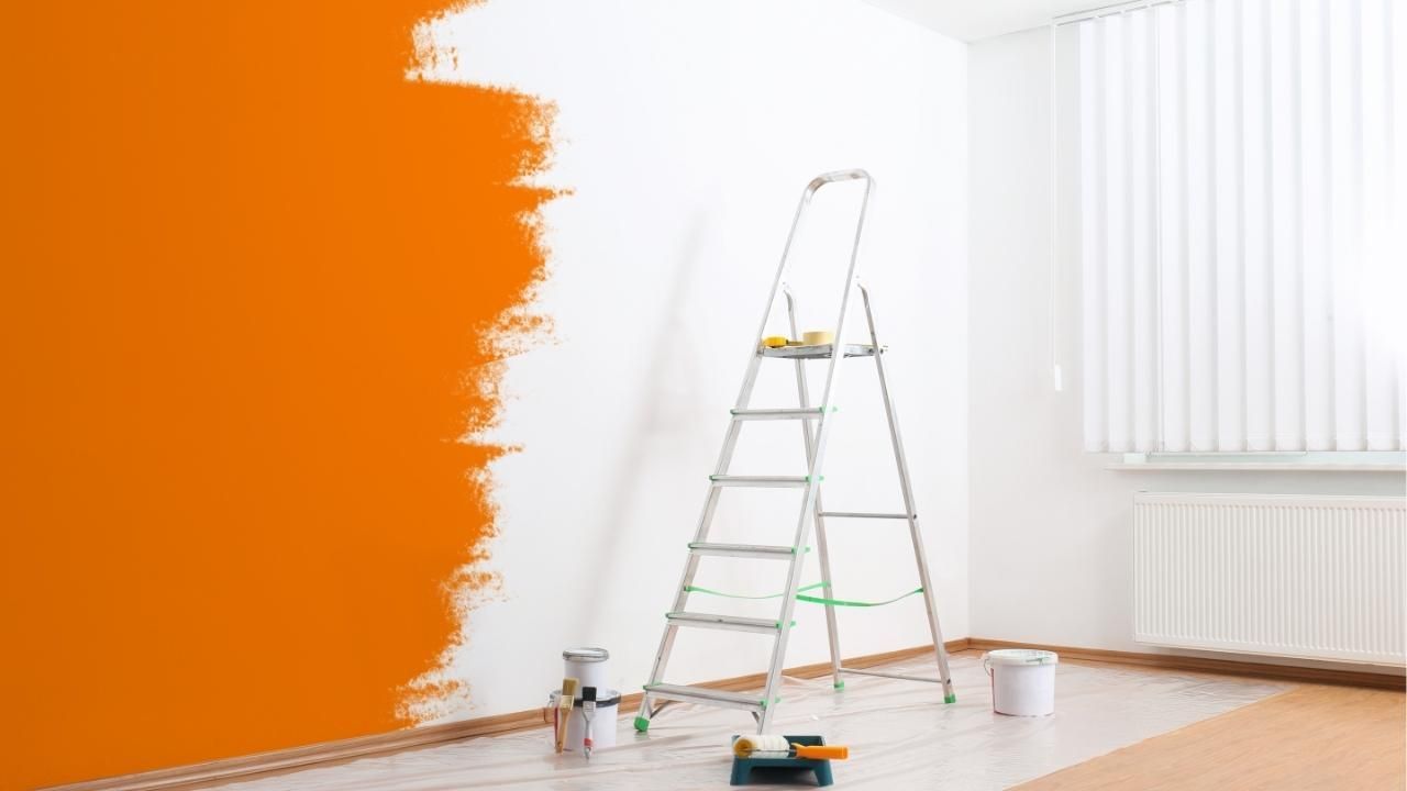
In this guide, you’ll learn how to choose a door color that actually fits your home’s architectural style, avoids common mistakes, and boosts curb appeal without looking trendy-for-a-minute. If you’re working with an exterior house painter in Gresham Oregon, or weighing advice from Premier Painting & Contracting LLC, getting the color right before the brush hits matters. Homeowners who rely on experts offering exterior painting services tend to avoid the costly redo that comes from guessing.
Start With Architecture, Not Personal Preference
Here’s the hard truth: your favorite color doesn’t matter if it fights the house. Architecture always comes first. A door should look intentional, not rebellious.
Ask yourself:
- Is the home modern, traditional, craftsman, or farmhouse?
- Are lines clean and minimal, or layered and detailed?
- Is the exterior warm-toned or cool-toned?
These answers narrow your options fast, and that’s a good thing.
Door Colors That Work by Home Style
Modern Homes
Modern architecture thrives on restraint. Bold doesn’t mean loud.
- Matte black, charcoal, deep navy
- Natural wood stains with minimal gloss
- Avoid bright reds or overly warm tones
Traditional Homes
These homes benefit from timeless, proven choices.
- Classic red, hunter green, navy blue
- High-gloss finishes work well here
- Avoid stark whites or trendy grays
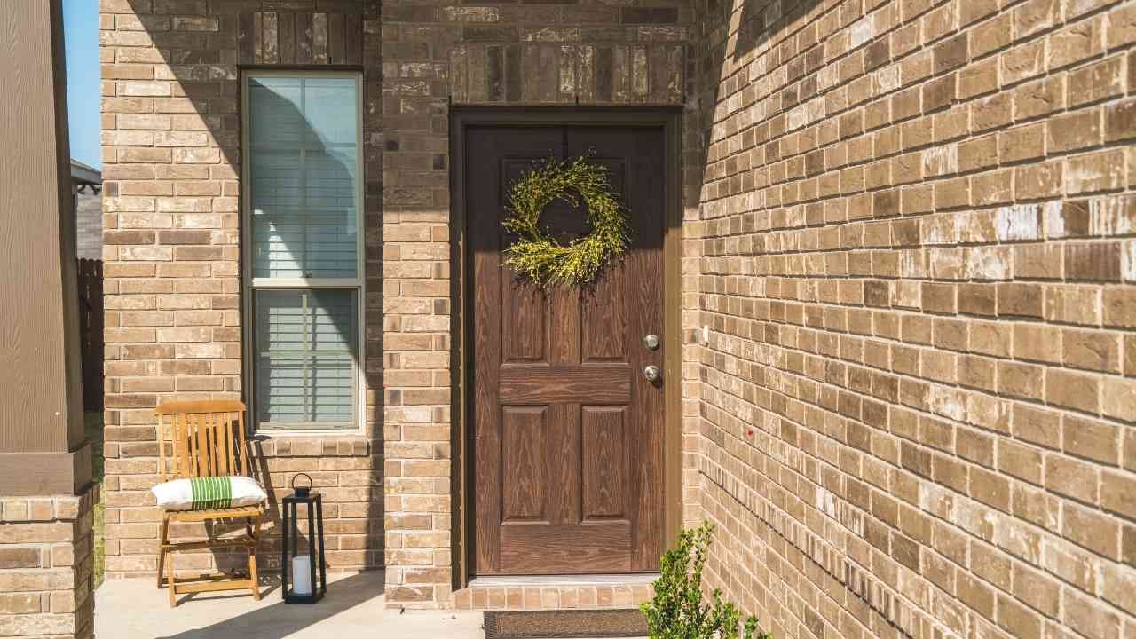
Craftsman Homes
Craftsman design leans earthy and grounded.
- Olive green, warm brown, muted teal
- Satin or semi-gloss finishes
- Skip anything neon or high-contrast
Farmhouse & Rustic Styles
Simple, welcoming, and honest.
- Soft black, cream, sage, slate blue
- Wood tones with visible grain
- Avoid high-gloss or ultra-dark stains
Use Contrast, But Don’t Overdo It
Contrast is your friend, chaos is not. A door should stand out just enough to guide the eye.
Smart contrast tips:
- Light house? Go darker on the door.
- Dark siding? Choose a lighter or warmer door.
- Match undertones with trim and hardware.
If your siding, trim, and door are all competing, the result feels noisy. Aim for harmony, not drama.
Case Study: One Color Change, Big Impact
A homeowner with a beige craftsman-style home originally chose a bright red door to “add personality.” It clashed with the stone accents and warm trim, making the entry feel forced. After reassessing the architecture, the door was repainted in a muted olive green with a satin finish. The change was subtle but powerful, the home instantly looked cohesive and higher-end. Neighbors noticed, compliments followed, and the homeowner avoided repainting the entire façade just to fix a single bad choice.
Finish Matters More Than Most People Think
Color gets the attention, but finish seals the deal.
- High-gloss: Formal, traditional, eye-catching
- Semi-gloss: Safe, versatile, durable
- Satin: Modern, understated, forgiving
Wrong finish + right color still equals wrong result.
Final Word: Choose With Intent
Matching your door color to your home’s style isn’t about playing it safe, it’s about playing it smart. Respect the architecture, control contrast, and think long-term. If you do that, your front door won’t just look good today, it’ll still look right years from now.
Before committing to paint, step back, assess your home’s style honestly, and choose a door color that works with it, not against it.
Ready to Transform Your Curb Appeal?
Choosing the perfect shade can be overwhelming, but you don't have to do it alone. Whether you need a professional color consultation or a flawless finish, we are here to help.
Contact us today to schedule a consultation and make sure your first impression is the right one.