How to Create a Cohesive Color Scheme for Your Entire Home

Choosing colors for your home can feel overwhelming, especially when every room has its own personality yet needs to flow seamlessly with the rest of the house. A cohesive color scheme brings balance, enhances the mood, and makes your space feel intentional rather than pieced together. For those who want professional guidance, many homeowners turn to residential painting services in Gresham OR from trusted providers like Premier Painting & Contracting LLC, since experts can help you create a unified look while saving time and stress. But even if you’re planning a DIY approach, a few strategies can help you pull everything together.
This article will walk you through practical steps for building a color palette that reflects your style and keeps your home visually harmonious. Whether you’re choosing a neutral foundation, experimenting with bold hues, or hiring painting services for a complete refresh, the key is thoughtful planning.
Start with a Base Color
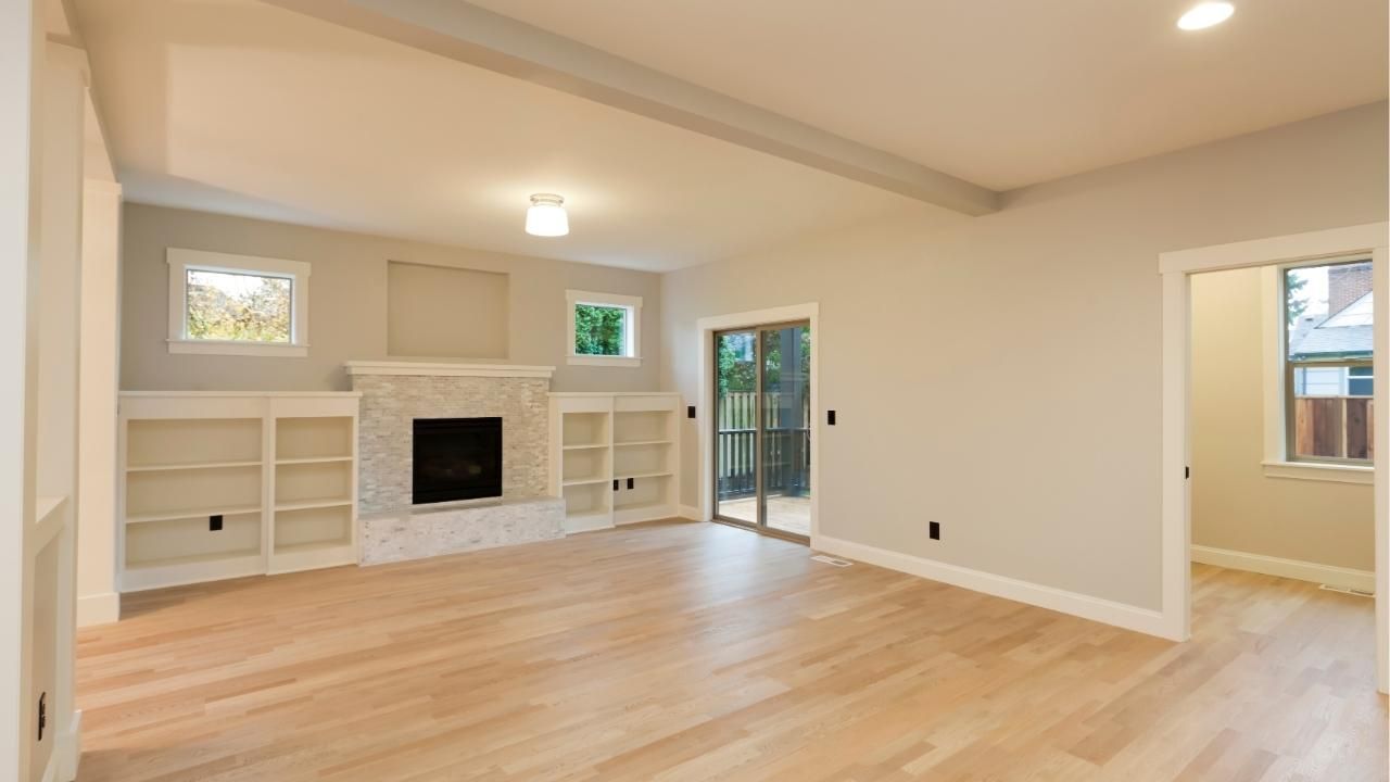
Every strong color scheme begins with a foundation. A base color—often a neutral like beige, soft gray, or creamy white—gives your home a unifying backdrop. This shade doesn’t need to dominate every wall but should appear consistently throughout the house. Hallways, ceilings, and trim are perfect places for this grounding color, helping tie rooms together without feeling repetitive.
Create a Palette of Three to Five Colors
Limiting your palette makes it easier to achieve a balanced look. Choose one dominant color, a couple of secondary tones, and one or two accent shades. Think of it like building an outfit: your dominant shade is the main clothing piece, while secondary and accent colors are accessories.
For instance, you might choose a soft gray as the dominant color, pair it with navy and sage green as secondary tones, and use mustard or blush as accents. With a clear palette in place, you can vary the application from room to room while still keeping everything tied together.
Use the 60-30-10 Rule
Designers often lean on this classic guideline for color distribution:
- 60% of a room should feature the dominant color.
- 30% should highlight secondary shades.
- 10% should pop with accents.
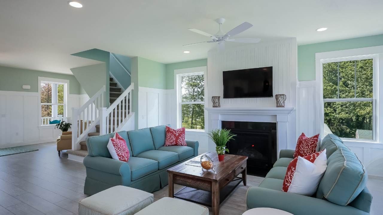
This rule prevents colors from competing and helps strike a natural balance. For example, if your living room has gray walls (60%), you could incorporate navy furniture (30%) and mustard throw pillows (10%). Repeat the same ratio in other rooms with different combinations of your chosen palette for continuity.
Consider Lighting and Room Function
Colors don’t exist in isolation—they interact with natural and artificial light. A color that looks warm in a sunlit living room may appear cool in a dim hallway. Always test paint samples on the wall before committing. Also, think about the mood you want each room to convey. Bedrooms may benefit from calming tones like soft blues or greens, while kitchens can shine with energizing shades like warm whites or light yellows.
Repeat Colors in Subtle Ways
Repetition creates flow. If you’ve chosen navy as a secondary color, it doesn’t have to appear on every wall. Instead, you might use navy curtains in the dining room, a rug in the entryway, or cushions in the family room. The more you echo colors across spaces, the more your home feels connected.
Case Study: From Fragmented to Flowing
A family in Gresham recently decided to refresh their home, which had walls painted in a different color for nearly every room—sage in the kitchen, burgundy in the dining room, and bright yellow in the living room. It felt disjointed. By working with painting professionals, they developed a palette anchored in soft gray with accents of navy and warm wood tones. The transformation was immediate: the house no longer looked like a patchwork of styles but rather a thoughtfully designed home where each room complemented the next.
Final Thoughts
Creating a cohesive color scheme doesn’t mean sacrificing variety. It’s about balance, repetition, and intentional choices. With a well-planned palette and a few design tricks, you can give your home a sense of flow that feels both stylish and welcoming.
Ready to bring your vision to life? Work with
home painting experts who understand color harmony and can deliver a flawless finish.
Contact Premier Painting & Contracting LLC today to explore professional options that will make your home’s transformation effortless.